restrictColorSpace = 1; // forces to grayscale
//==============================================================
$html = '
mPDF
New features in mPDF Version 5.1
This is a copy of Example 54, but all object colours are converted to grayscale using simply:
$mpdf->restrictColorSpace = 1;
- CSS background (images, colours or gradients) on <TR> and <TABLE>
- CSS border on <TR> (only in border-collapsed mode)
- support for Mozilla and CSS3 gradient syntax:
- -moz-linear-gradient, linear-gradient
- -moz-radial-gradient, radial-gradient
- -moz-repeating-linear-gradient, linear-repeating-gradient
- -moz-repeating-radial-gradient, radial-repeating-gradient
- expanded support for gradients (including in SVG images):
- multiple colour \'stops\'
- opacity (transparency)
- angle and/or position can be specified
- etc...
Tables: borders, background images & gradients
Background images or gradients can be set on whole tables or table rows (as well as individual table cells)
| Row 1 | This is data | This is data |
| This row has | a background-image | of the bayeux tapestry |
Row 3 | This is long data | This is data |
| This row has | a gradient set | which spans all 3 cells |
| Row 5 | Also data | Also data |
Border can be set on table rows (only when border-collapse is set to collapse)
| Row 1 | This is data | This is data |
| Row 2 | This is data
This is data
This is data
This is data | Also data |
Row 3 | This is long data | This is data |
Mozilla and CSS3 gradient syntax
Linear gradients
Angle set AND points e.g. -moz-linear-gradient(34% 84% 30deg, red, orange, yellow...
| top right 210 degrees |
|
|
| 30% 80% 60 degrees |
|
|
| 10px 40px 325 degrees |
|
|
| bottom left 135deg |
|
|
Points set only e.g. -moz-linear-gradient(bottom left, red, orange, yellow...
| bottom right |
|
|
| top |
|
|
| 10px 40px |
|
|
| 30% 10% |
|
|
Angle set but no points e.g. -moz-linear-gradient(30deg, red, orange, yellow...
| 90 degrees |
|
|
| 120 degrees |
|
|
| 180 degrees |
|
|
| 210 degrees |
|
|
Linear and radial gradients are not specified in the CSS2 specification. The CSS3 draft specification gives a way of outputting gradients, but currently this is not supported by any browser.
Mozilla (Firefox) has developed its own way of producing gradients, which approximates to the CSS3 draft specification:
- -moz-linear-gradient
- -moz-repeating-linear-gradient
- -moz-radial-gradient and
- -moz-repeating-radial-gradient
WebKit (Safari, Chrome etc.) have a separate way of defining gradients using -webkit-gradient
Microsoft (IE) does not support any such method of specifying gradients, but does have a function filter: progid:DXImageTransform.Microsoft.gradient()
When writing HTML for cross-browser compatibility, it is common to see something like this in a stylesheet:
background: #999999; /* for non-css3 browsers */
filter: progid:DXImageTransform.Microsoft.gradient(startColorstr=\'#cccccc\', endColorstr=\'#000000\'); /* for IE */
background: -webkit-gradient(linear, left top, left bottom, from(#cccccc), to(#000000)); /* for webkit browsers */
background: -moz-linear-gradient(top, #cccccc, #000000); /* for firefox 3.6+ */
mPDF versions <= 5.0 supported a custom style property background-gradient which accepted both linear and radial gradients. These continue to be supported (and both old and new forms can be used together); note the differences:
- mPDF background-gradients are output underneath background-images, and both can be specified; whereas the new CSS3/Mozilla-type gradients are defined as a type of background-image
- CSS3/Mozilla gradients support multiple colour-stops, opacity, repeating-gradients, and a greater number of options for defining the gradient axis (linear gradients) or shape and extent (radial gradients)
mPDF will attempt to parse a CSS stylesheet written for cross-browser compatibility:
- parse and support -moz type gradients
- parse and support CSS3 gradient syntax
- ignore -webkit syntax gradients
More details can be found at:
Repeating gradients
background: repeating-linear-gradient(red, blue 20px, red 40px);
background: -moz-repeating-linear-gradient(top left -45deg, red, red 10px, rgba(255,255,255,0) 10px, rgba(255,255,255,0) 20px);
background: repeating-radial-gradient(20px 30px, circle farthest-side, red, yellow, green 10px, yellow 15px, red 20px);
background: repeating-radial-gradient(red, blue 20px, red 40px);
Radial gradients
Gradient Image mask
Gradients (linear or radial) can also be used to produce \'masks\' for images. The same syntax is used as for background gradients (e.g. -moz-linear-gradient) but is set using a custom mPDF style: gradient-mask. The rgba() method for defining colours is used: colours are ignored, but the opacity value is used to mask the image.
<img src="windmill.jpg" style="gradient-mask: -moz-radial-gradient(center, ellipse closest-side, rgba(255,255,255,1), rgba(255,255,255,1) 30%, rgba(255,255,255,0) 90%, rgba(255,255,255,0));" />
<img src="windmill.jpg" style="gradient-mask: -moz-radial-gradient(center, ellipse closest-side, rgba(255,255,255,1), rgba(255,255,255,1) 70%, rgba(255,255,255,0) 90%, rgba(255,255,255,0));" />
<img src="windmill.jpg" style="gradient-mask: -moz-linear-gradient(left, rgba(0,0,0,0) , rgba(0,0,0,1) 50% , rgba(0,0,0,0) 100%);" />
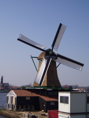
Image orientation
Images can be rotated using a custom mPDF HTML attribute: rotate. mPDF now also supports the draft CSS3 property of image-orientation. Rotation can be expressed in degrees, radians or grad units; it is corrected if necessary to an orthogonal rotation i.e. 90, 180 or 270 degrees. NB This does not work on background-images.
<img src="tiger2.png" style="image-orientation: -90deg" width="100" />
<img src="tiger2.png" style="image-orientation: 3.14159rad" width="100" />

Image resolution
Image files (which do not have an output width or height specified) are displayed in mPDF at the default resolution set by the variable $mpdf->img_dpi. This can be overridden using the draft CSS3 property \'image-resolution\', which can be applied to <IMG> or background-images.
The next 3 image files are identical (300px x 300px) but they have been saved with a different specified resolution: the first at 96dpi, the second at 300dpi.
NB When used in combination with \'from-image\', a specified resolution is only used if the image does not have an intrinsic resolution. Only JPG, PNG and BMP files store a specified DPI resolution in the file.
<img src="tiger300px300dpi.png" style="image-resolution: from-image;" />
<img src="tiger300px300dpi.png" style="image-resolution: 150dpi;" />
<img src="tiger300px96dpi.png" style="image-resolution: from-image;" />


Image resolution can also be applied to a background-image. This can be used as an alternative to the custom mPDF style property - \'background-image-resize\'
<div height="300px" width="300px" style="background: #FFCCEE url(tiger300px96dpi.png); background-image-resolution: from-image; border: 0.2mm solid black;">
Hallo
world
<div height="300px" width="300px" style="background-image: url(tiger300px300dpi.png); background-image-resolution: from-image; border: 0.2mm solid black;">
Mixed effects
';
//==============================================================
$mpdf->WriteHTML($html);
$mpdf->Output(); exit;
//==============================================================
//==============================================================
//==============================================================
//==============================================================
